
Problem
A 2011-era site with eight nav links, no visible way to book, and a desktop layout on phones.
A concept redesign showing how an established practice with an outdated website could present itself with greater clarity, trust and focus.
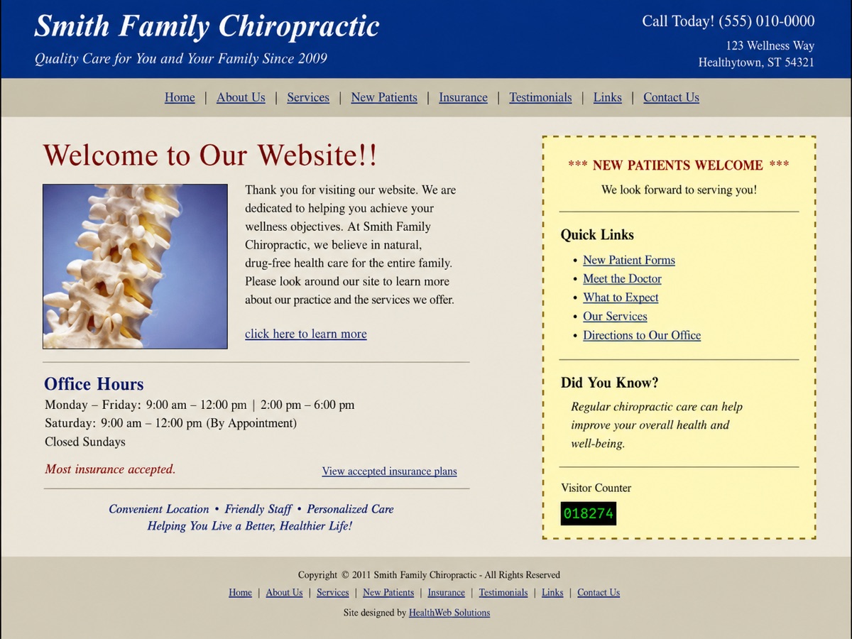
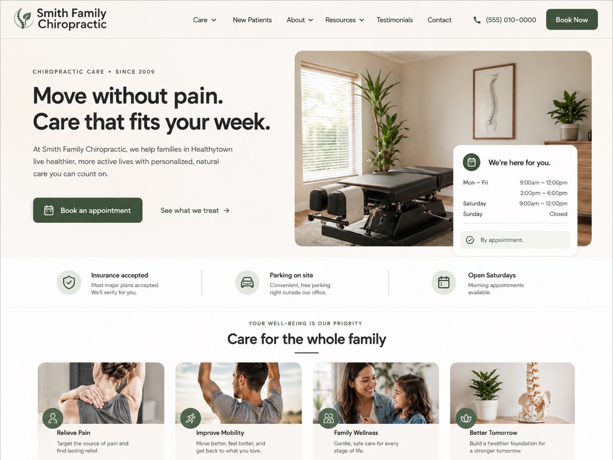
A 2011-era site with eight nav links, no visible way to book, and a desktop layout on phones.
Hierarchy: everything the same size. Trust: dated visuals and no clear proof. Action: no obvious next step. Mobile: a desktop layout shrunk to fit.
Lead with one promise and one action. Move secondary content one tap away. Make availability visible without a phone call.
Drag the comparison above to the left to see the original structure the concept started from.
Warm neutral base, confident type, a single accent reserved for the booking action, and generous spacing so the practice feels calm and current.
One screen answers what, why and how. Booking is one tap on every device.
For a client version: a fast, responsive build, connected booking and inquiry flows, and Website Care so the site stays current after launch.
This is a concept project with no live metrics. For client projects this block holds verified before and after measurements once they exist. Never estimated.